Yesterday I went home to take some photos of my Granddad. He wasn't too pleased when I said I needed an old weathered face! I tried to replicate the stock image I used last week to explain my idea in the critique.
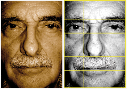
Again I've had to focus on the grid when positioning the type. The face forms a natural grid with the nose in the centre.

I have to work in the text so it becomes part of the image. It shouldn't obstruct the image but must also be clear and legible. The one on the left feels more 'edgy' and 'current', but we've been warned about having type on its side as we naturally read from left to right.

I've started to come up with my own grid, its a mixture of the two above. Using the natural grid of the face, and the lines in the face as contours/guidelines for the type.
Its a very hard task, working the type into the image. I think the concept is perfect so I need to work on placement of the type, because I want to get it right. I'm going to look into other black and white posters and see how they deal with type.

