Thursday 16 December 2010

Flash a-ah saviour of the universe!

Todays tutorial was on Adobe Flash, something I've been wanting to learn how to use for a while. It's a lot more complicated than Illustrator but allows you to do a lot more!

We started off with the basics; creating frames, key frames and 'scrubbing' through those frames.

Action Script 2.0
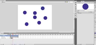
The menu and toolbars are quite different to those in illustrator and photoshop. Apparently this is because Flash was created by Macromedia and bought by Adobe.

Symbols
Creating symbols helps to keep the file size down. To do this go to the top menu bar: Modify > Convert to Symbol (F8)

Tween
Next we looked at a process called 'Tweening' which allows you to animate the symbol you have created. There are two main types of tweening; Motion and Classic Tween. Classic Tween allows Flash to create the path for you from the 1st frame to the last. Motion allows you to make your own motion path.

Nesting

Nesting is the process of placing symbols into other symbols, creating groups of symbols.

Movie Clips

Movie Clips are self contained/ independent flash movies that will continue to 'loop'. They are basically symbols with motion.

The standard rate of frames is 24 frames per second, so the 24th frame is 1 second. This is the preferred speed as it tricks the eye into thinking the frames are continues rather than separate images flashing.

Tuesday 14 December 2010

Marek Reichman - Aston Martin

I recently found out that a Teesside University graduate, who studied Industrial Design, is now Director of Design at Aston Martin. Marek Reichman was recently awarded a 'Doctorate in Professional Achievement' by the University.

Below is the latest car created by Marek's design team. The car is said to be a piece of art in itself but what first caught my eye was the way it was shown to the public, almost like an installation in a gallery.
The way the OLED lamps reveal the car as they light up the room is a very clever way of introducing the car to the audience.

Inspiration

I've been doing a bit of research for my new task, in which we have to incorporate our logo into a poster and web banner.

Pentagram is a british design studio who have a nice section on poster design on their website:

This particular poster, designed by Michael Bierut, was interesting as I thought it related to my 'appearing over time' concept. The way the letters overlap each other make it harder to read but symbolise light traveling to the viewer.

Photoshop Tutorial

Never really used photoshop before, everyone seems to start of using it but I got the CS3 version of illustrator a few years ago and taught myself how to use the adobe software on that.

We've bene looking at the more technical side of Photoshop; file size, saving for web and resolution.
Above are samples of different image resolutions being viewed at 100%. 300dpi - is the preferred choice of resolution in commercial print.
We also played around with different layers and brush strokes in photoshop. I haven't used the stamp tool before but I can see it being useful in the future.
Next was how to save your files for web and devices. Care has to be taken when deciding on image quality and file type.  

Old Work

Found some old collage work today, I'd scanned a few pieces in a few months ago for my interview.
The work is from one of my A-level projects entitled 'Paradise'. I ended up with this idea of Adam & Eve in the Garden of Eden.
This was a copy of one of Albert Durer's etchings 'The Expulsion' which shows Adam & Eve getting sent out of the Garden.

Monday 13 December 2010

RKCR - Winter Olympic Ad

A few days ago @andyidesign talked about an animation on his blog, which was shown before an England game on ITV. It reminded me of the animation which was shown during the Winter Olympics on the BBC.
It was created by RKCR (Rainey Kelly Campbell Roalfe) a creative agency I descovered during my research for the 'Top 40' task. I really like the style of the artwork and how they have encorporated the differant sports into the short.

They have done some really nice work, in particular the new BBC Radio 2 advert which can be seen here;

Saturday 11 December 2010

Stereogram

A 'Stereogram' is an optical illusion that creates depth in a 2D image. After some research I found a website that helps you create your own Stereogram:

I found that in order to create a stereogram you need a 3D image known as a depth map. White appears closer to the surface and black appears flat. A mask is then applied, which is made out of a repeating pattern.

Above is the depth map which should appear in the image. I'm not brilliant at it but after a while I can see it quite clearly. 

Eureka

I think I may have stumbled onto an idea last night, I wasn't in the bath like Archimedes but I think the discovery is of equal measure to his water displacement idea!

After deciding to be more experimental in the way I created my logo, I went back to one of my original ideas of a logo appearing over time. I thought the idea behind a logo taking time to show itself to the viewer fit the overlying theme of 'forensics' and 'electrophoresis'.

I was looking at the 'dot logo' (2 posts below) and was thinking about how the circles appeared to be on different levels. This layering was created by applying a drop shadow, the bigger circles cast a larger shadow over nearby circles, creating the 'illusion' that they were on top.

I began to think about optical illusions and it suddenly dawned on me! I remembered staring for hours into the 'Magic Eye' books when I was younger trying to make the hidden image appear.
I've decided to investigate 'Magic Eye Illusions' and see if I can create one with the UKFSEG name inside.

Friday 10 December 2010

Illustrator Tutorial

Today we had a tutorial in Adobe Illustrator. We experimented with different 'live trace' techniques. Live trace can be very useful as it creates a wide range of images.
I also learnt about 'Kerning' and 'Tracking in the character panel on illustrator. I can use this design technique on my UKFSEG logo as there are so many characters it is hard for the viewer to read. By creating more space between the letters or separating them into groups we can make it easier on the eye.

Experiment

Yesterday after my afternoon critique I decided to be a bit more experimental with my logo design. I wanted to try come up with something different to the norm.

My tutor mentioned 'Why Not Associates', who are experimental in the way they think about logos and how they are seen by the public.

http://www.whynotassociates.com/
After looking through some of their work for inspiration I decided to go back to one of my original concepts 'decoding', where the image appears over time like a DNA profile.
I think the white on white type is an interesting visual as well as some of the dots appearing 'closer' to the top of the page/surface.

Wednesday 8 December 2010

Routemaster

The new 'route-master' was unveiled last month and I thought it was a really interesting design. Modern but still in keeping with tradition.
I found some really nice photos on the following blog -http://designmind.frogdesign.com/blog/london039s-new-big-red-bus.html

Colour

I've shown a few people the idea and a few of them have said they can't see the fingerprint and think the colours blue/pink are normally used for boys and girls.
By using different shades of gray i think the logo starts to look more like a fingerprint. I have the full day in the studio tomorrow so have outlined a few areas I need to work on:

1. The type needs a lot of work, it needs to be 'business like' but still fit in with the logo.
2. The shape of the 'people' needs to be made more obvious.
3. The position of the text in relation to the logo.
4. The logo needs to be tested in different formats and on different backgrounds and sizes.

Design Process

Not sure I explained that very well, below is the thought process involved when creating the logo.
1. So I took one of my original sketches (the fingerprint on an angle) and tried to encorporate this idea of people meeting, forming a bond. The work force connection logo showed three people joining hands viewed from above.

2. Next I created my own 'meeting people' and joined them with the centre of a fingerprint image. The 'arch' in the centre of a fingerprint resembles the head.

3. I then had to link these two 'people-prints' and reverted back to the original print shape in the first sketch. 

Sketches

I've been working on a way of expressing 'links' and 'networks' using forensic imagery. DNA intertwined with itself, fingerprints joined together etc
I think a few of the ideas are worth pursuing further, they are simple but effective. I particularly like the logo below. I feel that the 'fingerprint shaped person' with their arms out linking with another person perfectly symbolises the aims of the UKFSEG. Forensic graduates meeting and working with potential employers.
I've experimented a bit with the idea to see if it could work in different ways. For now it looks like it has potential, the monotone version in the top right still works, the white out of blue bottom right and with a drop shadow bottom left.

For now this concept is going to be under the title: 'Print-Link'

Networking and Growth

I've been doing a bit of brainstorming with this idea of 'education' as a process rather than looking at graduation and qualifications. I have to think about what education does and how it is achieved.


Thesaurus


- Education, Learning, Instruction, Edification, Development, Training, Progress, Advance, Increase, Growth, Enlargement, Improvement, Expansion, Evolution, Obtaining Knowledge, Acquire, Attain, Gain

- Networking, Linking, Set of Connections/Contacts, Association, Group, Relation, Tie, Bond
I was sent a link to the above photo which can be found on http://twitpic.com/photos/Astro_Wheels. I thought that the roads connecting cities is a great example of my new 'Network' concept. I really like the lights of the cities and small towns against the black empty space.

I think its a great representation of a 'Network' and 'Expansion'

Re-start

After the tutorial yesterday I've done a lot of re-thinking about the logo and the concepts I had in mind. Its nice to use forensic images to create logos. The electrophoresis process shown below produces a nice visual result of a DNA profile.
 
However, the logos I've created so far don't necessarily meet the aims of the UKFSEG presented in the brief. After speaking to my tutor today, who is our liaison with the group, I've discovered they want to tone down the use of the forensic imagery. That means scrapping the magnifying glass! 
I had grown attached to the logo above, I thought it portrayed the idea of forensics clearly but wasn't too overwhelming. During the initial talks with the UKFSEG representative I got the impression the group wanted the idea of 'education' and the joining of employers and students to be portrayed in their logo. So I've decided to put these logos to side for now and go back to the drawing board.

Tuesday 7 December 2010

Tutorial

Had a very helpful yet depressing, tutorial today. We discussed our ideas with the class and got some feedback from some of the teachers. I now feel that the idea is becoming too complicated/busy. So I've decided to go back to some of my sketches and keep it simple!
In the above logo I've changed to a 'Georgia' typeface which I feel fits the science/business like theme of the group better.  

Monday 6 December 2010

Amazing Logos

While researching for the logo project I came across this website:

http://dzineblog.com/2010/02/45-creative-and-beautiful-logo-design-you-shouldve-seen.html

It is a very useful blog for designers; with tutorials, templates and pages of inspiration. They even have articles on blog design!

This is one of my favorite logos so far, designed by Richard Fonteneau. It is logo perfection!
However, after looking into the golf club I found out its a name put to a logo, rather than a logo made to a specific brief of a company. Still, its genius!

Concept 2 - Decoding

For tomorrows lesson we need 3 logo ideas that we are happy to develop further into final designs. I've been working on the 3 design concepts and think this one works quite well for the 'decoding' group.
I think that the layering and opacities applied to the letters creates a depth that allows the image to 'appear' over time. This symbolises the ideas found in my research of DNA profiling and electrophoresis. 

Friday 3 December 2010

Animation

I've just found this stop-motion animation I made a while ago. It was a scene from the children's book 'A Box of Nothing' by Peter Dickinson.


In the story the boy uses the box to travel to a different dimension, I tried to show the difference between the two realties in the methods used to draw them. The alternate reality was created with modeling clay and when he returns home he becomes illustrated.

Logo Concepts

I've decided on three 'Concepts' for the UKFSEG logo. These concepts have broad titles so can contain varied ideas.

1. Decoding - After researching the DNA profiling techniques and the images produced I came across this idea of revealing the logo over time.

2. Missing Piece - As a Forensic Team search the evidence for a missing piece of the crime 'puzzle' I've decided to work this idea into a logo. This could be the letters as jigsaw pieces or possibly the letters linked together. (Which could also symbolise the joining of the forensic students with employers)

3. Letterforms - my final concept idea came about while looking at logos using the name of the company as an image. I've decided to use the UKFSEG to create symbols/images. (The logo below falls into this concept idea)

Thursday 2 December 2010

Logo Research Task

Worked a bit on my 'History of Design' module today, talking about the reliability of websites. Wikipedia is an obvious one for the unreliable sources as anyone can update the pages.

I had a few more ideas for my UKFSEG logo. I've worked a bit on the U because it wasn't very clear when the image was smaller.

Again this one looks nice on my screen but when reduced in size it becomes hard to make out. I think possibly adding a bit more of a drop shadow to the U to make it stand out from the fingerprint. Or I could even make the actual print darker.

Wednesday 1 December 2010

Logo - Update

I've made a few changes to the logo. When I sent the link for the blog to my brother he said that on the thumbnail, when the logo was smaller the F and S were too close together and looked like a P. After adding the drop shadow the S and E ended up looking like they were over-lapping.  


I also need to look into the fingerprint in the U, when the logo is smaller it becomes blurred and un-recognizable. I may need a more simplified version of the print.

UKFSEG - Idea


Ok so I started off researching the company a bit; what they do, what there aims are, how will the logo be used.

Next, I looked into similar companies and logos already out there. I found a lot of focus on forensic imagery (test-tubes, fingerprints, crime scene tape, footprints etc) 

I decided that the only way to include these images in my logo was to be subtle. After a few hours of looking at logos online I came across this blog with some amazing designs.

http://dzineblog.com/2010/02/45-creative-and-beautiful-logo-design-you-shouldve-seen.html

It showed me that I can use the letterforms to my advantage, to create the images.
This is my first attempt, I tried looking at the negative space created by the letters and found the finger shape in the 'U'. I tried a few different ideas, at one point the 'S' looked like a shoe print. I settled for the 'G' and after a few attempts managed to get it to resemble a magnifying glass.

Digital Graphics

Last week we started our 'Digital Graphics' module. It consists of a series of tasks which will introduce us to industry standard software packages used by designers today.

The first task is to produce a logo solution for one of the following clients:

The Modern Times
UKFSEG (Live Brief)
Boho Zone

I have decided to go for UKFSEG, a group who aim to bring together students studying forensics at university and employers. I think the idea of a live brief appealed to me, it would be a good experience to meet the client and possibly have one of my ideas chosen.

I also think that studying both Biology and Chemistry for A-Level influenced my decision to go for the Forensic Science group.

Graphic Skills

The following are my final pieces from the 'graphic skills' module. It consisted of three short projects where we had to react to a given piece of text.

The first project was to work with type to express the themes found in 'Under Milk Wood', a play written by Dylan Thomas.
Next was the image project and the poem, 'Panic Bird' by Robert Phillips. I created a mobile of 'hand shadow puppet' shaped birds and a wire birdcage.
Finally, was the Sequence project where we had to listen to an extract from the movie 'Pi' directed by Darren Aronofsky. 
The final piece had to be 3 separate images which worked together. After researching the idea of a 'Palindrome', I settled on the symmetry of the circle image used in both pic.1 and pic.3.

First Post

I'm currently studying Graphic Design at Teesside University and I've decided to create a blog as part of my 'Professional Studies' module.

We have been asked to document our journey throughout the first year. I'm starting a bit late so will have a backlog of posts for you all to read. 

James